As we know, independent designer brand owns an obvious personal brand characteristics, which must be embodied in their works, so do their retail shop decoration and store fixtures if have. If it’s an eyewear brand store that commits to creating high quality, handmade eyewear inspired by the people, places, and stories of birthplace, perhaps you will get certain inspiration from the followed cases to update your retail store then provide customers a unique shopping experience.
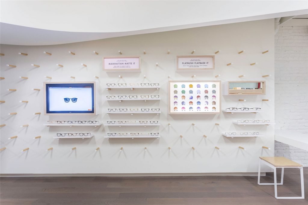
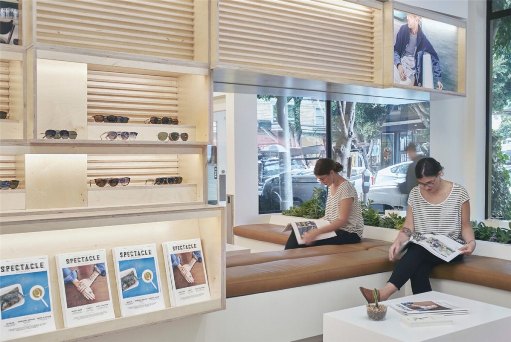
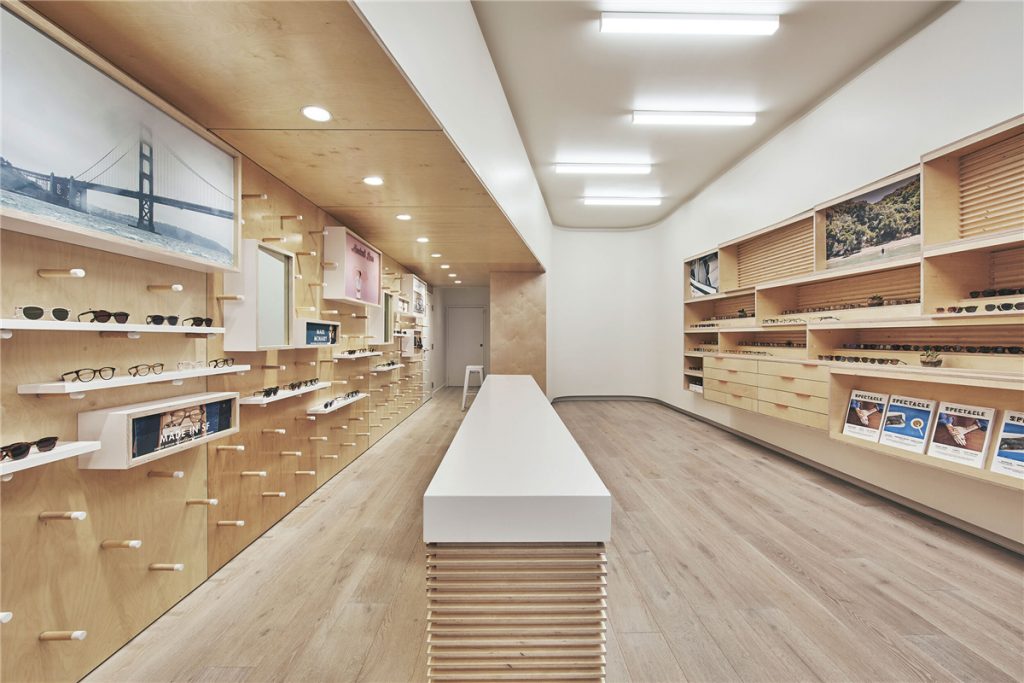
It selects wood and white color as the store basic color tone to create a friendly, amiable and natural atmosphere to improve shopping experience, without any negative element, such as black cold metal. Plywood is used for wall mounted cabinet, pegboard and cash counter, which let you easily distinguish from other stores meanwhile plant a deep impression into your mind. Two birds with one stone.
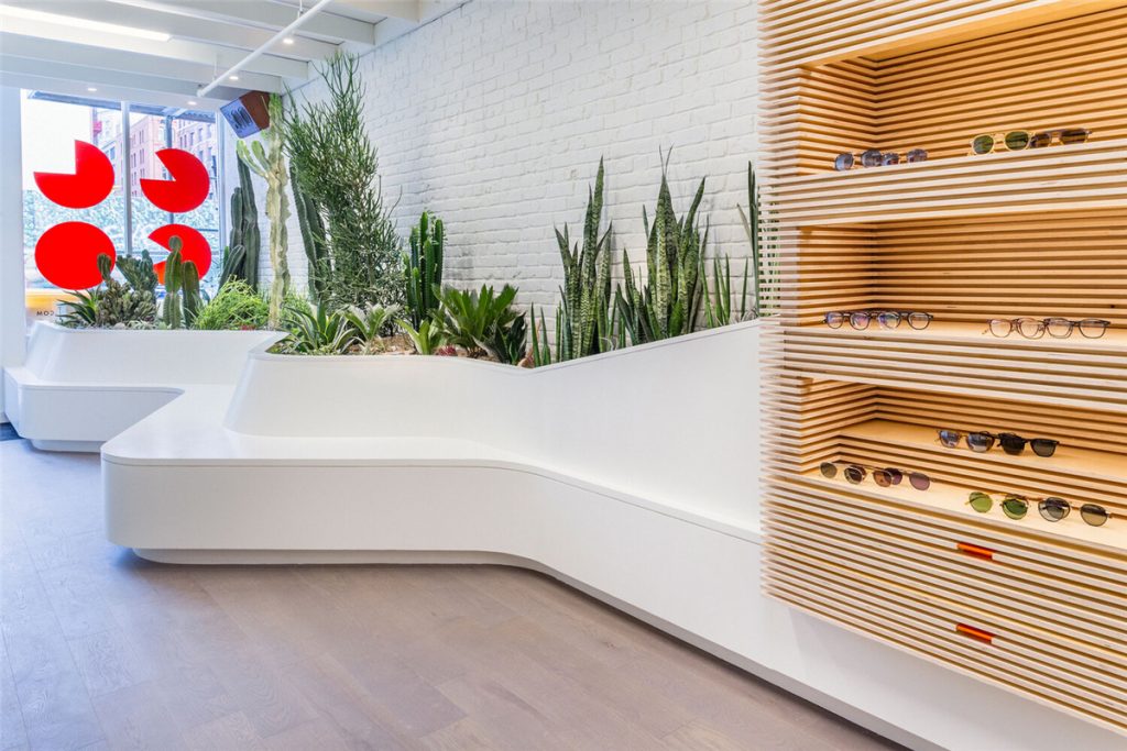
We believe as an optical shop, green plants should be indispensable while neglected by most of retailers. Here, the plant does not mean one or two plants that happy shopkeeper or salespeople, but as a main part of shop decoration. Now we have a good sample sharing with you as attached: They created custom planters into the fixtures and on-site decoration to build a comfortable and harmonious surrounding, to let customers close to nature. Really brilliant design to match the brand language.
About the interior of the store, it’s better and beneficial to absorb inspiration from nature. Perhaps you found that, this store focal point is the lighting system and ceiling design.
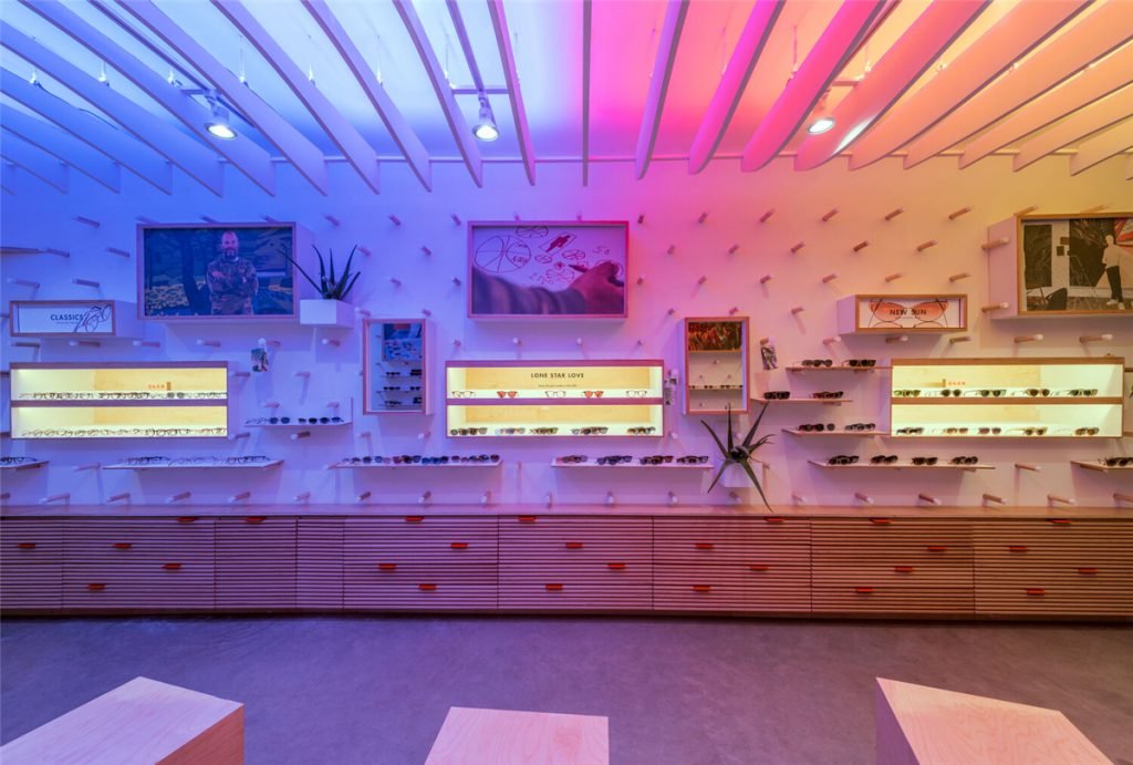
They were inspired by the relaxed light created by long summer sunsets then used a color-changing light installation and crafted a calm ceiling “cloud” that floats overhead transforming the space into an immersive spatial atmosphere.
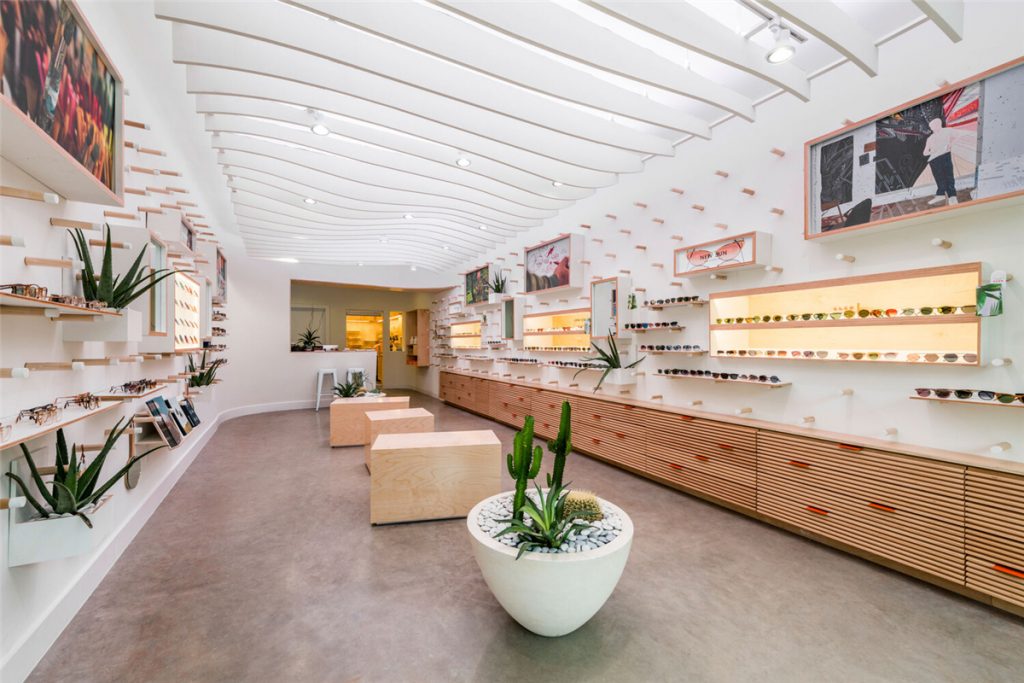
Next is the cultural heritage. Their flagship store is a love letter to the local car culture, and streamline the wall decoration as design language of cars. So, the walls are manipulated in section to encourage customers participation and are clad in a system of pegs which can support a variety of display objects. Meanwhile, this flexible system allows the retail store to continually adapt to the seasonal changes of product and media essential to the brand.
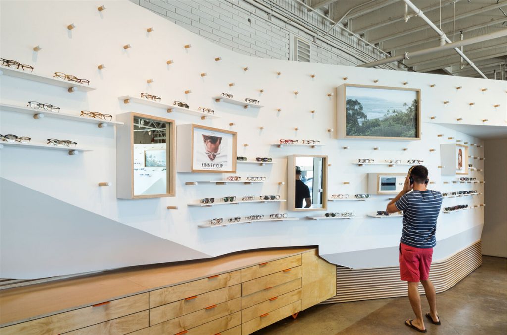
Of course, the independent designer brand couldn’t lack its own brand culture. The string wall decoration of its stories which shows the rich culture of this eyewear brand that how it connects with its users through storytelling creates a cohesive space to physically experience the brand within a narrow space in this store.
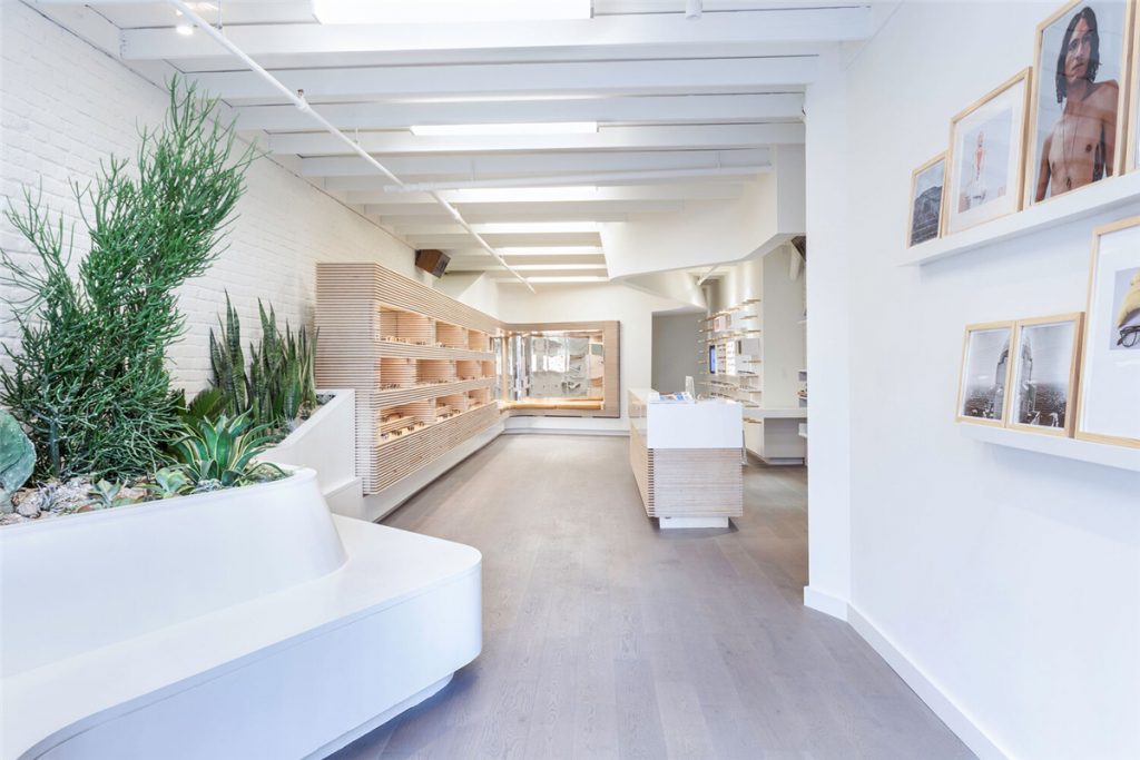
To contain these experiences they distorted the most ubiquitous of architectural objects, the wall. This wall bends, twists, and lifts its way around the space to capture the experiences and connect the various media produced by the brand.
The final outcome is a continuous white ribbon that transitions from one condition to the next, connecting stories to spaces.
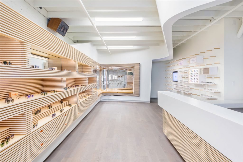
Finally, if you want to fully use the limited space to offer customers considerate service, it might as well decorate a small, leather clad seating area like this store to occupy the storefront.
